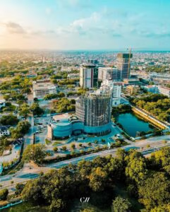
Wondering about the Bengaluru font on this book’s title? We have used Bengaluru’s new logo on the title, an innovation in itself! Bengaluru is the first Indian city to get its own logo, and joins the company of New York, Singapore, Venice, Amsterdam and other cities that have an exclusive logo. The logo is partly in English, and partly in the state language of Kannada, reflecting the city’s cosmopolitan character. The emphasis on ‘Be’ and ‘U’ celebrates that this city allows the freedom to be yourself.
, ![]()
![]()
Red and white in colour, and in sans serif font, the rolling typography conveys fluidity, boldness and vitality. The font was created by bankers-turned-designers Rushi Patel and M Venkateswara Rao, who are the founders of Nammur, a two-year-old creative design start-up which was formed in 2016. Their design won a crowdsourced contest by the Department of Tourism and was picked from 1350 entries. The government’s aim was to boost tourism with a logo that would give the city a fresh identity by incorporating all that Bengaluru stands for: diverse population, customs, nightlife, and to show that it is more than just the Indian Silicon Valley.
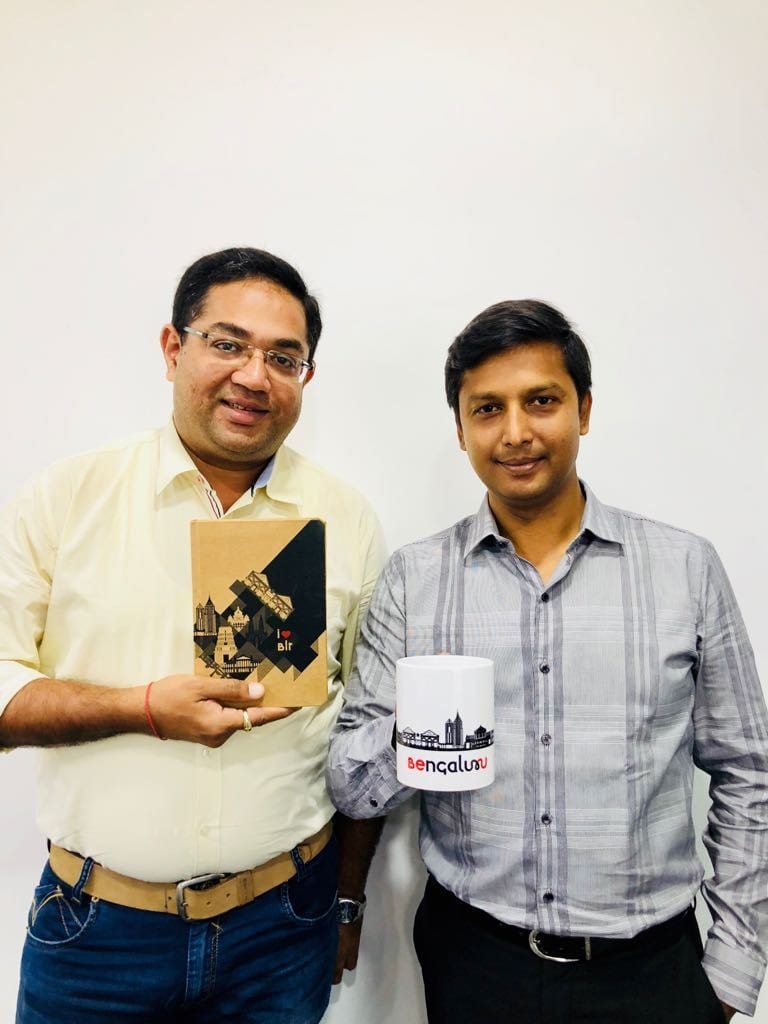
Rushi Patel and M Venkateswara Rao with Nammur’s unique branded merchandise.
,
Bengaluru logo: The capital of Karnataka, the city of Bengaluru’s logo celebrates the laissez-faire ethos of the city. It allows you to ‘be yourself.’
“There was always an urge to move out from the job (banking) and do something on our own”, says Patel. Not having taken part in a competition before, creating the winning logo was a big leap for the company. It took them a year of hard work to finalise a design that they found attractive and adaptive. And the rest of the state agreed.
Elaborating on the logo and its genesis he adds, “If you observe the logo, the letters B, U and E are in a different colour. The red is standing out saying ‘Be you’. Bengaluru is one of the biggest cities which accepts everybody and anybody. They can be themselves in the city and they can prosper. That is the reason the logo is written in that fashion”.
‘Nammur’ translates into “our city” in Kannada and the company’s work is focussed on designs that are story-based. The logo for Bengaluru is just the start for Patel and Rao, and they aspire to replicate this for many other cities across India. Nammur has an online platform that sells merchandise that range from power banks to keep your mobile phone going through the city’s notorious traffic to keychains, books, mugs, T shirts and more. They plan to open a retail outlet within Bengaluru, to start with. “Our vision is to portray and display the ‘Incredible India’ (the slogan of India’s tourism campaign) for culture to the world through various designs”, says Rao in this interview with Minnal Paranan.